Case study
Rethinking Scaled Pricing For B2B E-Commerce
Researching The Causes Of Bulk/Scaled Pricing With Business To Business Customers


overview
About 3M's bCom
You may often associate 3M with the infamous post it note and Scott tape. Many people are often surprised when they find out, 3m produces and sells over 60,000 products across several industry categories in more than 70 countries under several brands operating in the fields of industry, worker safety, US health care, and consumer goods. This makes the company a diversified manufacturer and marketer of products from personal protective equipment, adhesives, fire protection, dental products, electrical materials, medical products, car-care products, all the way to healthcare software. 3M doesn’t only sell to consumers (otherwise known as B2C) but, the company also sells directly to other businesses (known as B2B).
The Product
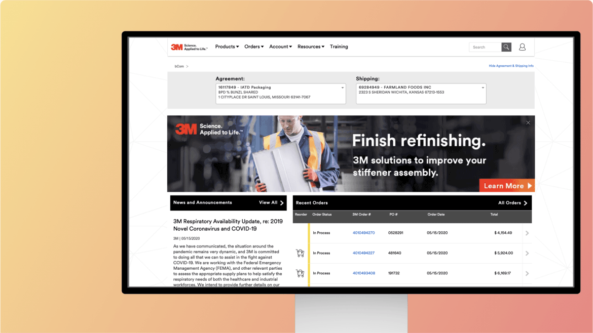
A majority of these sales come through a B2B e-commerce platform online known as 3M’s “bCom”. The e-commerce site is a way for qualified business partners of 3M to search the product catalog, order products, view past orders and view prices for the various product needed for their own products. The product itself is known as bCom, which is relatively new as it only launched in 2014.
Unlike the B2C e-commerce team which was compromised of plenty of designers (easily over 25), however bCom only had two designers. This means the entire project of bcom was only run by a small team of designers and bandwidth to get things designed in time was short. This is where 3m consulted and hire accenture as the team to implement and aid bCom’s efforts.
Problem
As a ux design consultant, we often get put on projects as the sole designer otherwise immersed within an existing design team depending on the client. I was placed on a project with 3M to help their business e-commerce team. This happened after the bandwidth of their design team was getting short, and when feedback from surveys spiked with negative responses about bCom. More specifically the negative responses revolved around Bcoms pricing structure but unfortunately the website was still relatively new so none of the site had been properly tagged for analytics where we would pull data to help us understand the context of customer’s problem. This also led to a spike in call center calls.
Audience:
As I mentioned 3M has hundreds of business partners that are using bCom. These companies range across wholesalers, distributors, dealers and retailers then sell 3M’s product to their own customers (the process otherwise known as supply chain for those unfamiliar).
Suppliers or manufacturers but more specifically our persona was the “Data Manager” which was any role within one of the business partner’s companies that dealt with uploading and managing price information to their own websites/systems. Roles included:
Long-standing users
Newer users
Data Managers
Marketing/Operations Managers
Based on past customer visits, customer service requests, and customer surveys, we knew that several specific aspects of working with 3M’s pricing data was frustrating and confusing. This is particularly relevant when it comes to giving out price quotes to their customers.
Objective
This intialated what was known as the Pricing LUX research project which spanned over a 5 week effort. The effort consisted of workshops with business stakeholders, performing contextual inquiries, and performing usability tests. 3M’s bCom partners rely on bCom to know the pricing of 3M’s products, either through a report that housed all the details & specifications of the products specific to their orders called the Price File Download (PFD) report, or through the Product Detail Pages’ pricing information. This targeted where specifically on the site we focused the tasks within.
Our Research Objective
We performed 5 contextual inquiries (talking to customers about their use of the site), and 5 usability tests (an activity where users perform realistic tasks to validate design decisions) per week. The usability testing spanned over 4 weeks to help aid on iterating designs of the site based on feedback.
Our goal was to improve the pricing experience in bCom this way in order to:
• Discover any unknown customer pain points regarding pricing and validate existing pain points
• Understand customers’ current understand and usage of bCom pricing options
• Understand what is most important to customers, on both the site functionality and the PFD output file data fields
My role was to help script writing for the usability design tests and help run them. I also created the prototypes for the usability tests. (4 prototypes in total).
Project Process
Find out the design
solution.
Lorem ipsum dolor sit amet, consectetur adipiscing elit, sed do eiusmod tempor incididunt ut labore et dolore magna aliqua.
Enim eu turpis egestas pretium aenean pharetra. Dui accumsan sit amet nulla facilisi morbi tempus iaculis. Eu ultrices vitae auctor eu augue. Sed turpis tincidunt id aliquet risus Purus in massa tempor nec feugiat nisl pretium fusce. Feugiat vivamus at augue eget arcu dictum. Gravida quis blandit turpis cursus in hac habitasse platea dictumst.

Finalize the project
Id nibh tortor id aliquet lectus proin nibh nisl condimentum. Habitant morbi tristique senectus et. Lectus urna duis convallis convallis tellus id interdum velit laoreet.
Enim eu turpis egestas pretium aenean pharetra. Dui accumsan sit amet nulla facilisi mor tempu iaculis. Eu ultrices vitae auctor eu augue. Sed turpis tincidunt id aliquet risus Purus in massa tempor nec feugiat nisl pretium fusce. Feugiat vivamus at augue eget arcu dictum. Gravida quis blandit turpis cursus in hac habitasse platea dictumst.
Result
Final Result
Id nibh tortor id aliquet lectus proin nibh nisl condimentum. Habitant morbi tristique senectus et. Lectus urna duis convallis convallis tellus id interdum velit laoreet.

Content creators and human resources personnel are able to seamlessly update the website through graphical interfaces, and the site simply rebuilds itself along with search engine indexes as the OpenWeb team continues to create.
Enim eu turpis egestas pretium aenean pharetra. Dui accumsan sit amet nulla facilisi mor tempu iaculis. Eu ultrices vitae auctor eu augue. Sed turpis tincidunt id aliquet risus Purus in massa tempor nec feugiat nisl pretium fusce. Feugiat vivamus at augue eget arcu dictum. Gravida quis blandit turpis cursus in hac habitasse platea dictumst.
overview
Background
In a previous project for a leading healthcare app, our goal was to improve the user experience for patients booking appointments and managing medical records. The client had an outdated interface that led to user frustration, especially for older patients. As the UX lead, I was responsible for a complete overhaul of the user flow, ensuring accessibility and ease of use while aligning with regulatory standards.

overview
Project Overview
Our scope included a full audit of the existing digital assets, user journey mapping, wireframe development, usability testing, and iterative design revisions. The project had a six-month timeline and involved multiple stakeholders, including healthcare professionals, legal teams, and patient advocacy groups.
overview
Sitemap
The sitemap was reorganized to create a more logical flow, with a focus on task-based navigation. Key features like appointments, medical records, and messages were made accessible from the main dashboard.
overview
The Challenge
The key challenge was the complexity of the healthcare system. We needed to simplify medical jargon, reduce cognitive load for users, and ensure the design was intuitive for a wide range of users, from tech-savvy millennials to older adults who were less familiar with digital interfaces.
overview
The Audience
The primary audience consisted of patients aged 30–65, many of whom had chronic conditions requiring regular appointments. Additionally, we had to consider healthcare providers who would use the system to manage patient data. The design needed to cater to both patient and provider needs without overwhelming either group.
overview
Project Process
Our research included user interviews, contextual inquiries, and a comprehensive content audit of the existing system. We identified pain points like long load times, confusing navigation, and inconsistent information presentation across devices.
overview
Project Process
We followed a user-centered design process, beginning with in-depth research and ending with multiple rounds of testing and iterations. Collaboration with the client’s IT, legal, and medical teams was essential throughout the process.
overview
Research
Our research included user interviews, contextual inquiries, and a comprehensive content audit of the existing system. We identified pain points like long load times, confusing navigation, and inconsistent information presentation across devices.
overview
Problem Statement
Patients struggled to find relevant information and complete tasks like booking appointments or accessing medical records. These issues led to high abandonment rates and frustrated users who often reverted to traditional phone bookings.
overview
Ideation
We brainstormed multiple design solutions, including simplifying the navigation, introducing a prominent “Next Appointment” feature, and improving the search function for medical records. The team sketched initial wireframes and discussed various interaction models that could solve the identified problems.
overview
Testing
Based on user feedback, we iterated the design several times, making adjustments to the user flow, adding tooltips for guidance, and improving error messaging. These iterations continued until users consistently completed tasks without confusion.
overview
Iterations
Based on user feedback, we iterated the design several times, making adjustments to the user flow, adding tooltips for guidance, and improving error messaging. These iterations continued until users consistently completed tasks without confusion.
overview
Design
The final design emphasized a clean, minimalist interface with clear calls to action. We used larger text, ample white space, and intuitive icons to improve accessibility. The navigation was simplified to a top-level menu, reducing the number of clicks needed to access key features.
overview
Outcomes
The redesigned app significantly reduced task completion time for booking appointments and accessing medical records. Feedback from patients and providers was overwhelmingly positive, especially regarding the system’s improved usability and clarity.
overview
Results
After the launch, user satisfaction scores improved by 35%, and the app saw a 20% reduction in appointment booking times. The client reported fewer calls to support for basic tasks, indicating the new design was more intuitive.
overview
Reflections
This project reinforced the importance of continuous user testing and iteration. While our initial design concepts were promising, the final product’s success was driven by iterative improvements based on real user feedback.
overview
Task Flow
We redefined the task flow for booking appointments, reducing the process from five steps to three. This simplified flow allowed users to quickly view available time slots, confirm their selection, and receive confirmation with minimal friction.
overview
Personas
We developed two primary personas: “Busy Parent” and “Chronic Condition Patient.” These personas helped us focus on distinct user needs, such as managing multiple family appointments or tracking long-term health data.
overview
User Interviews
We interviewed 15 users across a range of demographics to understand their needs, frustrations, and daily habits. These interviews provided the foundation for our design decisions and ensured we were solving real user problems.
overview
Workshop
We hosted a design thinking workshop with key stakeholders, including healthcare providers and IT staff, to brainstorm solutions. This collaborative approach helped align everyone’s vision and contributed to the overall success of the project.
overview
Contextual Inquiry
Contextual inquiries involved observing patients using the existing app in real-world scenarios, such as booking appointments while juggling daily responsibilities. This revealed pain points that weren't immediately obvious through interviews alone.
overview
Wireframes
We created low-fidelity wireframes for initial feedback and high-fidelity versions for usability testing. The wireframes allowed us to quickly iterate on the design before moving into full development.
