Case study
Examining Corrosion Engineering
Helping engineers on oil refineries analyze data to prevent equipment from damaging and increase different pipe circuits' life span.


overview
About BP
BP is a global oil and gas company operating in all oil and gas industries such as power generation, refining, and distribution. To perform at this scale, the company has thousands of oil refineries spread across the globe. This project aimed to create a dashboard that would help engineers on oil refineries analyze data to prevent equipment from damaging and increase different pipe circuits' life span.
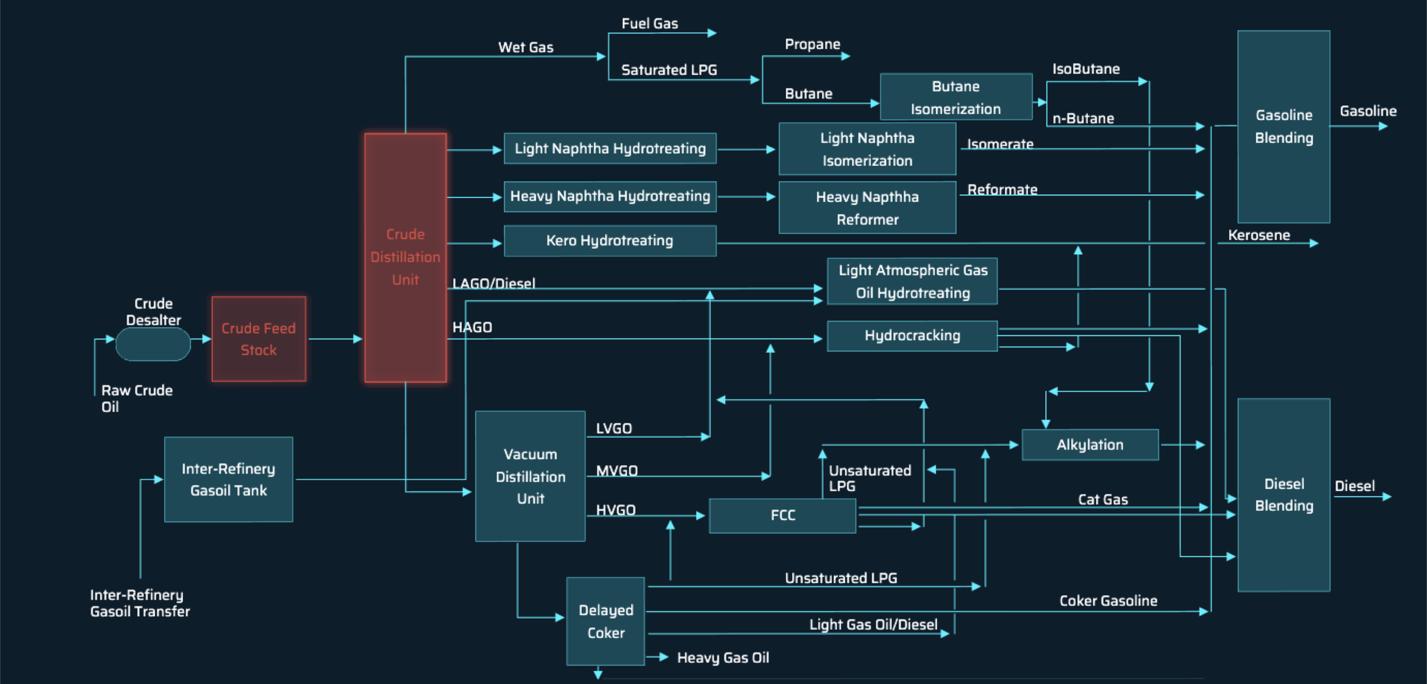
An oil refinery is an industrial process plant where crude oil is transformed and refined into more common products such as gas, oil, & diesel. The image below is a flow diagram of a typical oil refinery that depicts the various unit processes and the flow of intermediate product streams between the inlet crude oil feedstock and the final products. The flow represents only one of the hundreds of different configurations used by an oil refinery.
The User - Target Audience
With the equipment and piping continually being in use, any metals, especially piping, will corrode. The case of a corroded pipe, for example, brings many issues to the production as most of the parts are intertwined and dependent on the other connecting factors to function correctly. This production requires the equipment to be carefully maintained and looked after. This type of maintenance introduces our target audience, which is the role that takes care of this process, Corrosion Engineers.
Project Overview
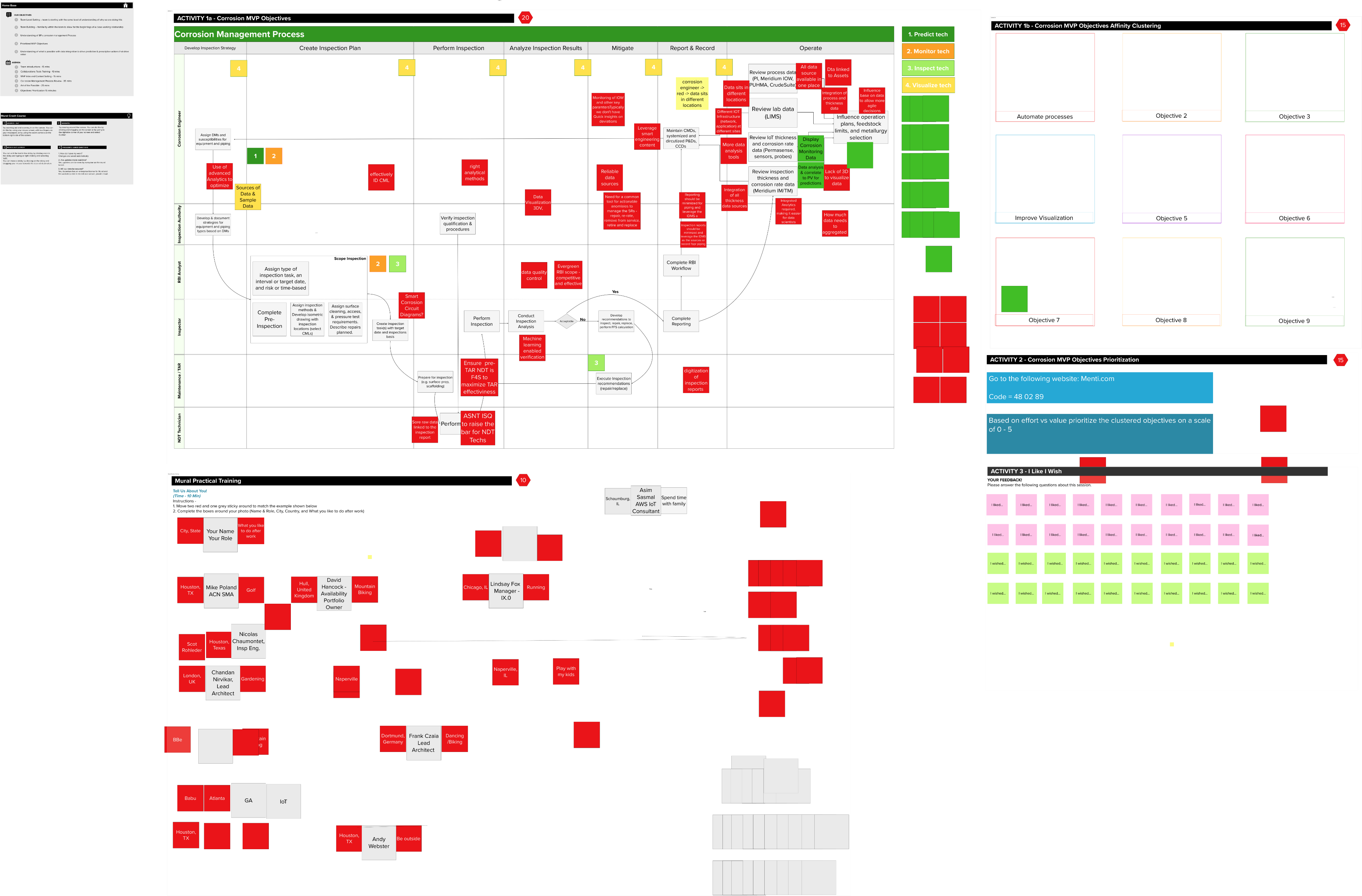
Following a discovery phase, this project aimed to design a dashboard for the corrosion engineers quickly. However, knowing the project had a concise timeline establishing the intention to iterate and refine the project’s future phases. Before the project kicked off, a discovery phase took place to help define future phases’ scope and focus on the corrosion engineers’ pain points in predicting damage due to corrosion. We utilized some of the workshop's outputs as shown below:
The project, known as the corrosion dashboard, would be a web-based dashboard for engineers to read and analyze data from different sensor readings of various oil refinery components, helping predict corrosion damage.
Problem
Corrosion was happening to individual parts(that could be prevented if noticed earlier) on plants without indication or warning signs. The breakdown of these parts is a problem because when these parts have to be repaired or replaced, the repair process requires the entire connecting circuit line to shut down. Every repair can potentially hurt the company because repair time leads to loss for the company regarding time to repair, cost, and resource allocation. The engineers prevent the corrosion from happening when noticed early through data pulled from sensors on the different pipes and equipment. The engineers look for patterns with this data to ensure the best route and effectiveness for a solution approach.
Across the equipment were sensors that feed data into an export file used by the oil refinery teams to help read different equipment attributes. The engineers use this data to find patterns or outliers in the information that signal potential damage occurring. The corrosion engineers manually completed this entire process. This lead to the idea of the corrosion dashboard.
The Goal
The corrosion dashboard’s original goal would help find common patterns in the data identified from the different sensors, allowing to read and identify the corrosion’s causation easier and quicker.
The User Problem
To understand the problems the engineers faced and what types of everyday tasks took place daily, we completed eight user interviews. These interviews allowed me to speak to a range of corrosion engineers and understand what errors and problems they had with the different software currently used to determine the cause of corrosion and the best approach. The problem starts when corroding circuits can’t operate due to damage, which would cause different areas of the refinery to shut down. This shut down leads to many resources being used to repair a circuit. These repairs are very costly to complete and take a lot of time in which the engineers could utilize otherwise.
Process
Interviews
We spend the first few days of the project user interviews with corrosion engineers from various locations worldwide. We got to speak to six different engineers in that time and asked questions to learn more about what they do specifically day today. As we learned more about their everyday activities, the focus began to switch towards tasks they perform regarding corrosion in equipment, what they do to mitigate risks, identify corroding components, and find a cause. We also focused on some of the pain points along that process that the engineers were having. A few interesting common trends surfaced within those conversations.
Insight:
* To reduce time and effort engineers spend in resolving corrosion issues
* To reduce the time taken to repair corroding circuits
* To visually be able to locate where equipment needing maintenance
* Help prevent future equipment and circuits from corrosion with better analysis methods and software.
Objective:
* To reduce time and effort engineers spend in resolving corrosion issues
* To reduce the time taken to repair corroding circuits
* To visually be able to locate where equipment needing maintenance
* Help prevent future equipment and circuits from corrosion with better analysis methods and software.
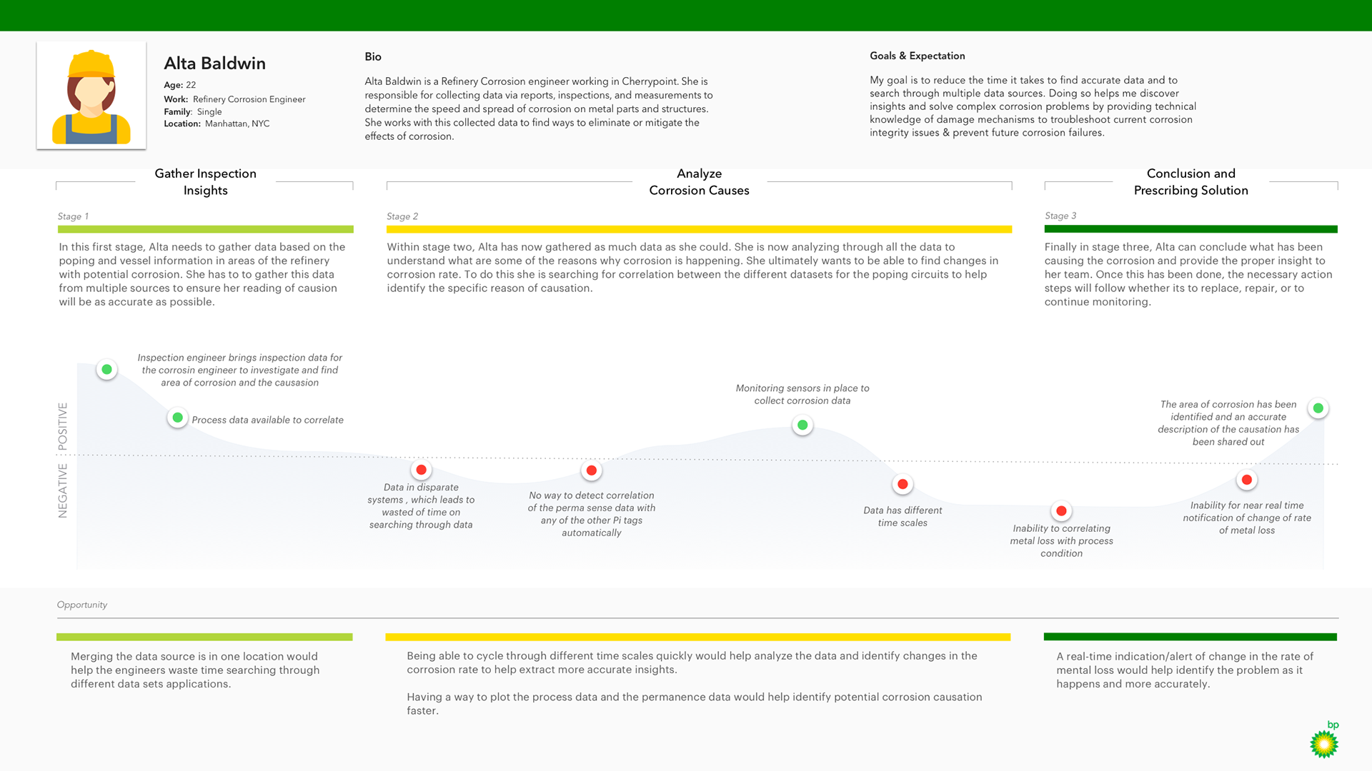
Personas + Journey Map
We didn’t want to lose the workshops and interviews’ insights to help communicate to the teams for the future phases. We created a user journey map, which focuses on the linear path a user would take to report corrosion issues. Creating a journey map also required us to complete a user person, a fictional character, highlighting the corrosion engineer’s profile. These personas highlight information on the engineers, such as their daily activities, goals, pain points.
Prototype
The scope included a prototype of a high-fidelity solution based on the workshop’s insights and the insights surfacing from the interviews. When the team in charge of scoping the project kept in mind that the prototype will continue to be iterated and reworked in future phases, this help settle some nerves as the prototype didn’t have to include all the screens. The prototype was more of a tool to help shape an MVP for the corrosion dashboard.
The prototype allowed a way to demonstrate multiple scenarios highlighting different tasks performed in the future corrosion dashboard. The tasks identified were:
* To locate the specific areas with corrosion issues
* Visualize where corrosion was happening and help determine which exact part
* Provide a way to dive into the data for that component and view further readings imported from the Permasense sensors.
* These tasks help the engineers identify corrosion causation and report findings to their team, and if necessary, change and improve the refinery processes of repairing equipment procedures.
Excepteur sint occaecat cupidatat non proident, sunt in culpa qui officia deserunt mollit anim id est laborum magna quis nostured.
Project Process
Find out the design
solution.
Lorem ipsum dolor sit amet, consectetur adipiscing elit, sed do eiusmod tempor incididunt ut labore et dolore magna aliqua.
Enim eu turpis egestas pretium aenean pharetra. Dui accumsan sit amet nulla facilisi morbi tempus iaculis. Eu ultrices vitae auctor eu augue. Sed turpis tincidunt id aliquet risus Purus in massa tempor nec feugiat nisl pretium fusce. Feugiat vivamus at augue eget arcu dictum. Gravida quis blandit turpis cursus in hac habitasse platea dictumst.

Finalize the project
Id nibh tortor id aliquet lectus proin nibh nisl condimentum. Habitant morbi tristique senectus et. Lectus urna duis convallis convallis tellus id interdum velit laoreet.
Enim eu turpis egestas pretium aenean pharetra. Dui accumsan sit amet nulla facilisi mor tempu iaculis. Eu ultrices vitae auctor eu augue. Sed turpis tincidunt id aliquet risus Purus in massa tempor nec feugiat nisl pretium fusce. Feugiat vivamus at augue eget arcu dictum. Gravida quis blandit turpis cursus in hac habitasse platea dictumst.
Result
Final Result
Id nibh tortor id aliquet lectus proin nibh nisl condimentum. Habitant morbi tristique senectus et. Lectus urna duis convallis convallis tellus id interdum velit laoreet.
Content creators and human resources personnel are able to seamlessly update the website through graphical interfaces, and the site simply rebuilds itself along with search engine indexes as the OpenWeb team continues to create.
Enim eu turpis egestas pretium aenean pharetra. Dui accumsan sit amet nulla facilisi mor tempu iaculis. Eu ultrices vitae auctor eu augue. Sed turpis tincidunt id aliquet risus Purus in massa tempor nec feugiat nisl pretium fusce. Feugiat vivamus at augue eget arcu dictum. Gravida quis blandit turpis cursus in hac habitasse platea dictumst.
overview
Background
In a previous project for a leading healthcare app, our goal was to improve the user experience for patients booking appointments and managing medical records. The client had an outdated interface that led to user frustration, especially for older patients. As the UX lead, I was responsible for a complete overhaul of the user flow, ensuring accessibility and ease of use while aligning with regulatory standards.

overview
Project Overview
Our scope included a full audit of the existing digital assets, user journey mapping, wireframe development, usability testing, and iterative design revisions. The project had a six-month timeline and involved multiple stakeholders, including healthcare professionals, legal teams, and patient advocacy groups.
overview
Sitemap
The sitemap was reorganized to create a more logical flow, with a focus on task-based navigation. Key features like appointments, medical records, and messages were made accessible from the main dashboard.
overview
The Challenge
The key challenge was the complexity of the healthcare system. We needed to simplify medical jargon, reduce cognitive load for users, and ensure the design was intuitive for a wide range of users, from tech-savvy millennials to older adults who were less familiar with digital interfaces.
overview
The Audience
The primary audience consisted of patients aged 30–65, many of whom had chronic conditions requiring regular appointments. Additionally, we had to consider healthcare providers who would use the system to manage patient data. The design needed to cater to both patient and provider needs without overwhelming either group.
overview
Project Process
Our research included user interviews, contextual inquiries, and a comprehensive content audit of the existing system. We identified pain points like long load times, confusing navigation, and inconsistent information presentation across devices.
overview
Project Process
We followed a user-centered design process, beginning with in-depth research and ending with multiple rounds of testing and iterations. Collaboration with the client’s IT, legal, and medical teams was essential throughout the process.
overview
Research
Our research included user interviews, contextual inquiries, and a comprehensive content audit of the existing system. We identified pain points like long load times, confusing navigation, and inconsistent information presentation across devices.
overview
Problem Statement
Patients struggled to find relevant information and complete tasks like booking appointments or accessing medical records. These issues led to high abandonment rates and frustrated users who often reverted to traditional phone bookings.
overview
Ideation
We brainstormed multiple design solutions, including simplifying the navigation, introducing a prominent “Next Appointment” feature, and improving the search function for medical records. The team sketched initial wireframes and discussed various interaction models that could solve the identified problems.
overview
Testing
Based on user feedback, we iterated the design several times, making adjustments to the user flow, adding tooltips for guidance, and improving error messaging. These iterations continued until users consistently completed tasks without confusion.
overview
Iterations
Based on user feedback, we iterated the design several times, making adjustments to the user flow, adding tooltips for guidance, and improving error messaging. These iterations continued until users consistently completed tasks without confusion.
overview
Design
The final design emphasized a clean, minimalist interface with clear calls to action. We used larger text, ample white space, and intuitive icons to improve accessibility. The navigation was simplified to a top-level menu, reducing the number of clicks needed to access key features.
overview
Outcomes & Reflections
The redesigned app significantly reduced task completion time for booking appointments and accessing medical records. Feedback from patients and providers was overwhelmingly positive, especially regarding the system’s improved usability and clarity.
overview
Results
After the launch, user satisfaction scores improved by 35%, and the app saw a 20% reduction in appointment booking times. The client reported fewer calls to support for basic tasks, indicating the new design was more intuitive.
overview
Reflections
This project reinforced the importance of continuous user testing and iteration. While our initial design concepts were promising, the final product’s success was driven by iterative improvements based on real user feedback.
overview
Task Flow
We redefined the task flow for booking appointments, reducing the process from five steps to three. This simplified flow allowed users to quickly view available time slots, confirm their selection, and receive confirmation with minimal friction.
overview
Personas
We developed two primary personas: “Busy Parent” and “Chronic Condition Patient.” These personas helped us focus on distinct user needs, such as managing multiple family appointments or tracking long-term health data.
overview
User Interviews
We interviewed 15 users across a range of demographics to understand their needs, frustrations, and daily habits. These interviews provided the foundation for our design decisions and ensured we were solving real user problems.
overview
Workshop
We hosted a design thinking workshop with key stakeholders, including healthcare providers and IT staff, to brainstorm solutions. This collaborative approach helped align everyone’s vision and contributed to the overall success of the project.
overview
Contextual Inquiry
Contextual inquiries involved observing patients using the existing app in real-world scenarios, such as booking appointments while juggling daily responsibilities. This revealed pain points that weren't immediately obvious through interviews alone.
overview
Wireframes
We created low-fidelity wireframes for initial feedback and high-fidelity versions for usability testing. The wireframes allowed us to quickly iterate on the design before moving into full development.
