Case study
Kickoff Made Easy: Simplifying Soccer with Seamless Game Organization
Connecting Players and Removing the Hassle of Scheduling Pick-Up Games with an Intuitive Mobile Experience


Mobile Developer
overview
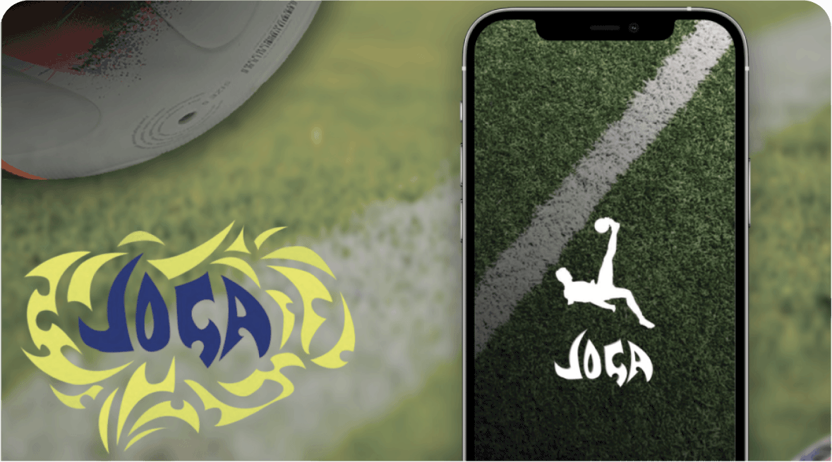
About Joga
Joga is a mobile app that helps ease the frustrations of trying to organize or play pick-up soccer games for players. It solves this problem by allowing players to discovering a pickup match nearby, the freedom to invite your friends,, create a pick up game, and invite their friends. This helps sort all the frustrating texts back and forth between friends and peers with simple match organization. My role was owner/sole designer. I collaborated with a native mobile app developer to help create the app and bring it to fruition.
Project Scope
Objective: The goal of this project is to explore and validate whether the frustration of organizing sports matches is a genuine pain point, identify who experiences it, and design a solution that alleviates this issue.
Research and Validation
Objective: Understand the frustration of organizing matches and identify the target audience who face these challenges.
- User Interviews: Conjogaducted interviews with 20 individuals who frequently organize sports matches (e.g., soccer, basketball, tennis). Participants ranged from casual organizers to league coordinators.
- Surveys: Distributed online surveys to a broader audience of 100 potential users to gather quantitative data on the frequency and intensity of the frustrations encountered.
- Competitive Analysis: Analyzed existing platforms and apps that cater to organizing sports matches to identify gaps and potential areas for improvement.
⠀
Findings:
- Validation: 85% of participants reported significant frustration when organizing matches, citing issues like coordinating schedules, managing RSVPs, and finding substitutes.
- Audience: The pain points were most pronounced among casual players who organize matches as a hobby, typically aged 25-40.
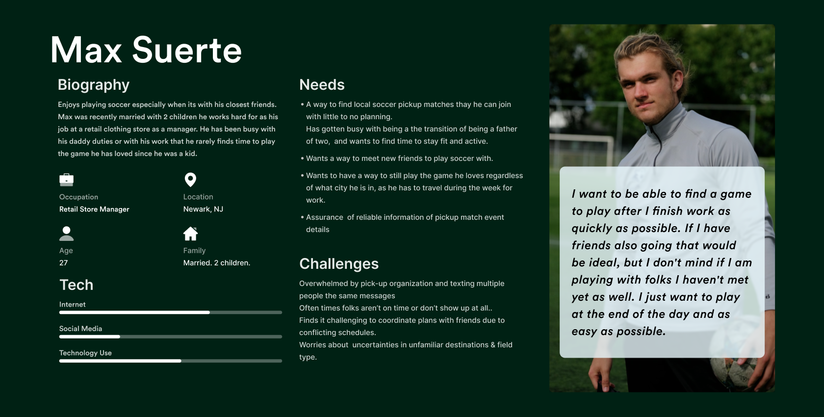
Audience
Primary Audience:
- Casual Organizers: Individuals who organize matches for social or fitness purposes, usually among friends or local community members.
- League Coordinators: Individuals responsible for organizing more formal matches or leagues with multiple teams.
⠀
Secondary Audience:
- Participants: Players who participate but do not organize, as their experience can also affect overall satisfaction.
⠀
Ideation
Objective: Generate ideas for a solution that addresses the identified pain points.
- Brainstorming Sessions: Held multiple sessions with the design team to explore potential features and functionalities.
- Concept Sketches: Developed initial sketches to visualize the potential solution.
- Feature Prioritization: Used a MoSCoW method to prioritize features based on user needs, feasibility, and impact.
⠀
Key Ideas:
- Smart Scheduling: Automated scheduling based on participants' availability.
- Dynamic RSVP Management: A feature that manages RSVPs and substitutes automatically.
- Integrated Communication: In-app messaging to streamline communication.
⠀
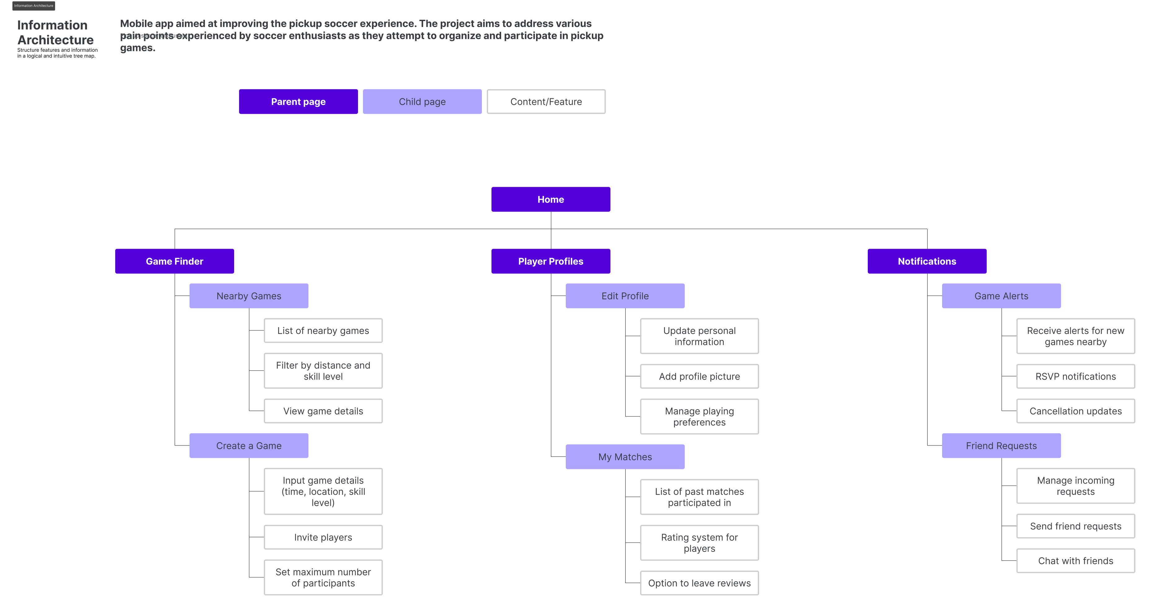
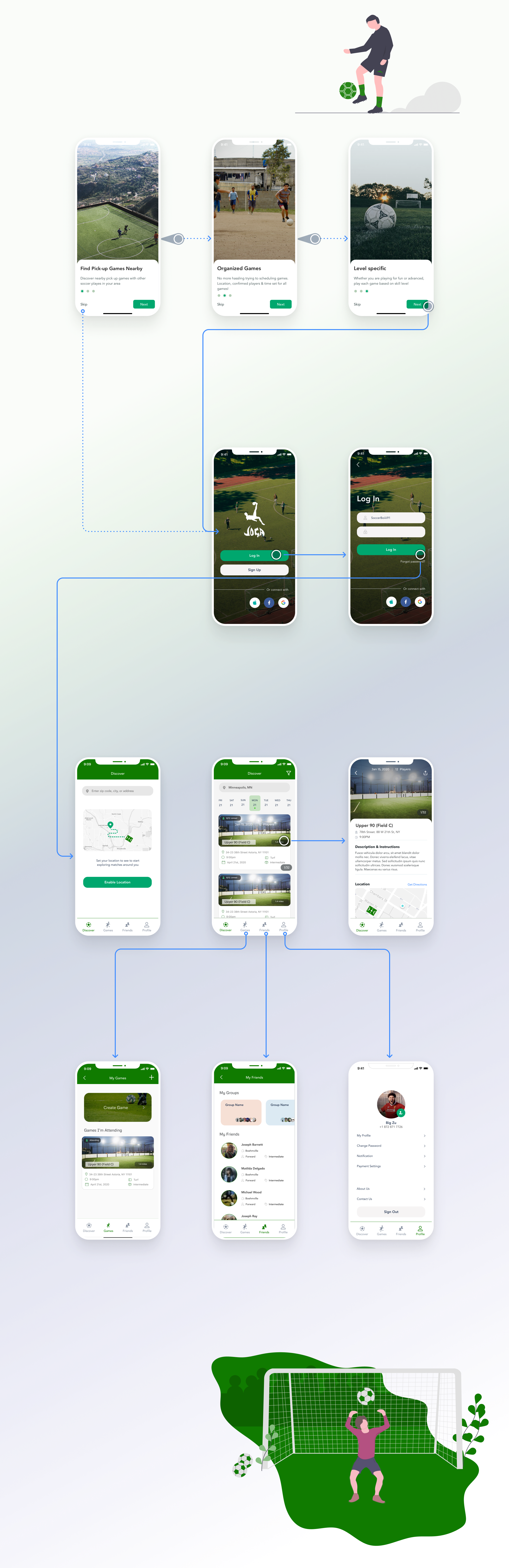
Sitemap
Objective: Create a clear and intuitive structure for the app.
- Home: Overview of upcoming matches and invitations.
- Organize Match: Tool for creating and managing matches.
- My Matches: Section for viewing and managing your organized matches.
- Messages: Central hub for all communications.
- Settings: User preferences, notifications, and account management.
Objective: Illustrate the complete user journey from start to finish.
- Sign-Up/Login:
- User creates an account or logs in.
- Organize Match:
- User initiates match creation, inputs details, and sends invites.
- Manage Match:
- User tracks RSVPs and communicates with participants.
- Match Day:
- User receives reminders, tracks attendance, and updates any last-minute changes.
- Post-Match:
- User sends out follow-up messages and prepares for the next match.
⠀
Testing
Objective: Validate the design with real users and gather feedback for improvements.
- Usability Testing: Conducted with 10 users from the target audience. Users were asked to complete specific tasks (e.g., organizing a match, managing RSVPs) while providing feedback.
- A/B Testing: Tested different UI elements (e.g., button placements, color schemes) to optimize user engagement.
⠀
Feedback & Iterations:
- Positive: Users found the smart scheduling feature particularly useful.
- Improvement Areas: Some users suggested additional customization options for notifications and reminders.
⠀
Visual Design
Objective: Create a visually appealing and intuitive interface.
- Style Guide: Developed a style guide with color schemes, typography, and iconography that reflects a sporty and energetic vibe.
- High-Fidelity Mockups: Created mockups for key screens, focusing on clean design and ease of navigation.
- Responsive Design: Ensured the design is responsive and functions well on both mobile and desktop devices.
⠀
Final Testing
Objective: Conduct a final round of testing to ensure all features are working as intended.
- Beta Testing: Released the app to a small group of users for final feedback.
- Bug Fixes: Addressed any issues that were identified during beta testing.
⠀
⠀
⠀
⠀
⠀
Final Results
Outcome:
- User Satisfaction: Post-launch surveys indicated a 30% decrease in the time spent organizing matches and a 40% increase in overall user satisfaction.
- Adoption Rate: The app saw a high adoption rate within the first three months, with over 2,000 active users organizing matches weekly.
- Continuous Improvement: Based on ongoing user feedback, regular updates are planned to introduce new features and enhancements.
⠀
————
Soccer is the most popular sport in the world
Played by over 300 Million globally
Viewed by 3 Billion globally
Most consistently played sport in the world
However, there is no platform where amateur soccer players can connect with one another
Before playing, a player must first:
- Find the necessary amount of players to complete a game
- Find a field to play at, and make sure that the field will be available just for them
- Manage field payments and make sure all players have paid
This process takes a lot of time out of a player's day, and many can't get past the first step, so they give up trying to play sport they love
In an age of instant gratification, soccer players should be able to connect and play on-demand with no barriers
Most popular sport in the world
- Played by over 300 Million globally
- Viewed by 3 Billion globally
- Most consistently played sport in the world
—
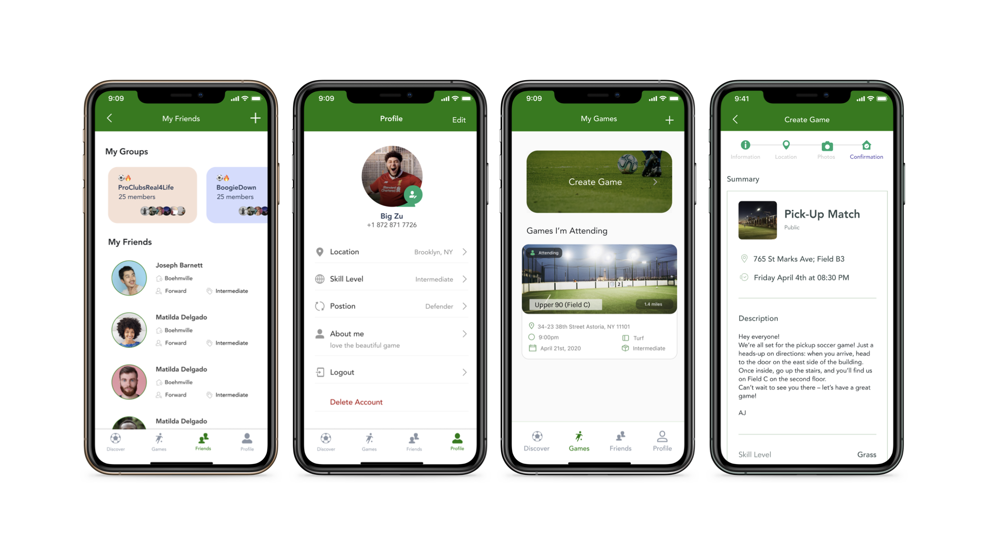
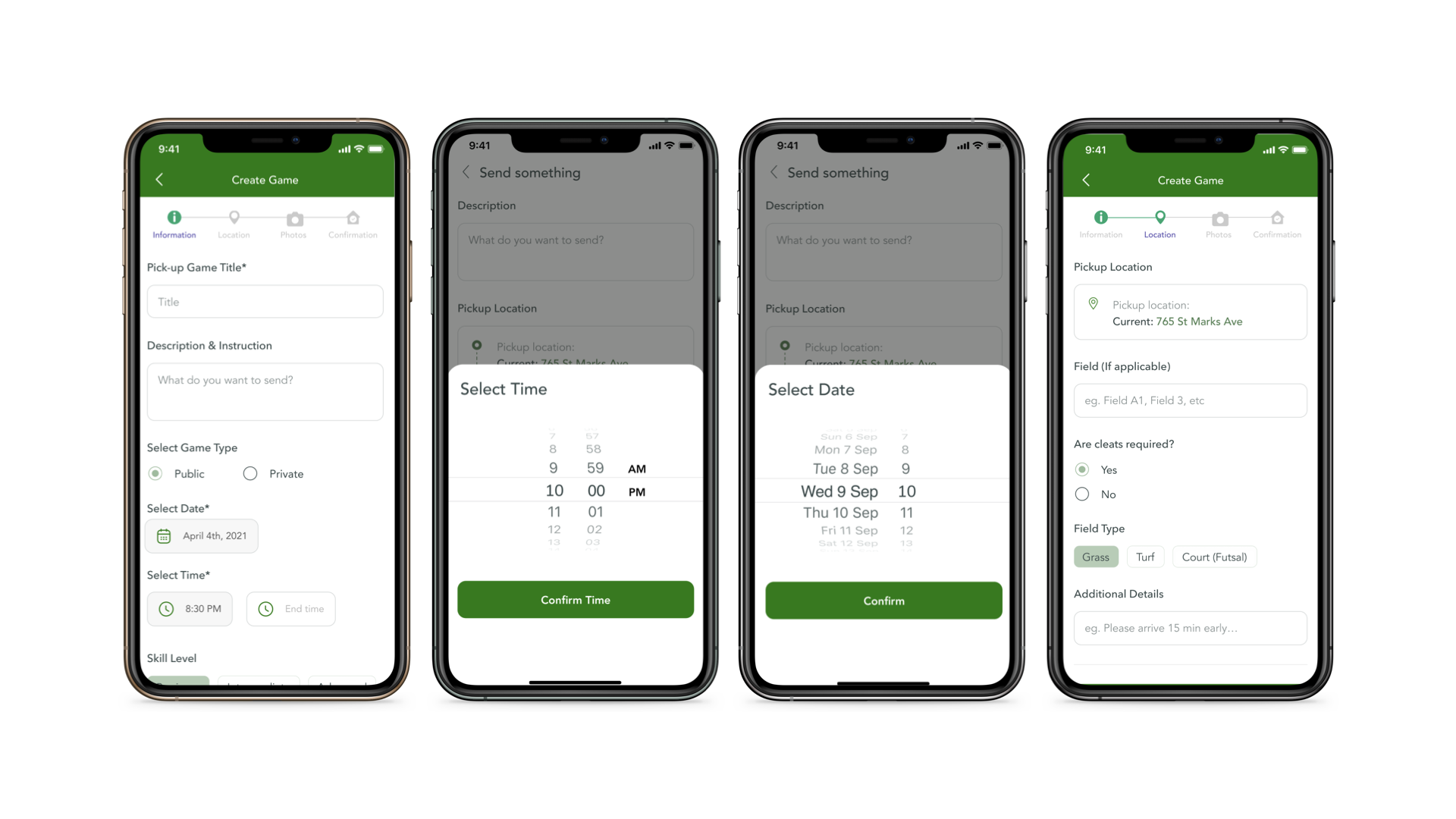
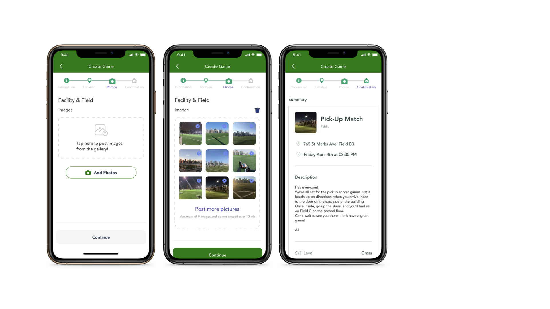
App Features
View Game Feed
Browse open games and see how many spots are filled in each game
Sort Games
Sort games by distance, time, and filter for skill levels
Join Game in 2 Clicks 1-2 passing makes a good footballer. 1-2 clicks is all it takes to get in the game
View Game Details Instructions so players know exactly what to do when arriving to the field
Pay for Game Payments securely processed in-app before the game
View Teams
See the teams inside the game details before the game
Update Status
Allows players to add / remove guests as well as leave a game (cancellation policy)
Customer Service Chat with Plei App representatives directly in-app for support
How was the game?
Review all aspects of the game, including the facility and other players
Book a Field
Players with a group of friends can book an entire field at local facilities
Add Friends
We believe in integrating social features into Plei
Look for Player
Connects players with groups who are missing players to complete their game
Messaging
Enjoyable experience through Direct & Group messaging
Suggested Games Curated suggested games based on player preference
Upload Media
Upload memorable moments during your Plei expereince
League/Tournaments Across multiple facilities in the city, creating a World Cup feel
logo1.svg-----
Do you love playing soccer but struggle to find games to join? Joga is here to help you out! With Joga, you can easily organize or join soccer games anytime and anywhere. No more worrying about finding social media groups or texting everyone to arrange a pick-up game. Joga simplifies the process by providing you with match organization tools and the freedom to invite your friends or find a pick-up game nearby. All you have to do is select a match, show up, and enjoy playing soccer. Download Joga now and experience the joy of playing the beautiful game! Joga Bonito!
Experience seamless soccer with Joga’s features:
- Find pick-up soccer games in your area easily to see daily games happening in your city.
- You can invite your friends to join you or add them as guests to your reservation.
- Get all the details you need, including location, parking, player info, and level of play
- Conveniently find nearby soccer facilities and meet new soccer fans
- Create and invite groups with your friends for routine play